How to generate MXML straight from
SQL Server 2008 !
Hello all,
I'd like to share my solution for creating PM-logs in mxml format straight from SQL Server.
The trick is to use the FOR XML PATH statement.
Consider you have a table with the following fields :
1. Event_key (e.g. DBCs_Key)
2. EventName (e.g. Closing DBC)
3. DateTime event
3. Department
With the next SQL statement you can easily create the MXML output that is needed for PROM or other tools.
SELECT hdr.DBCs_Bkey as "@id"
,
(
SELECT
EventName as "WorkflowModelElement"
,'Start' as EventType
,DateTimeEvent as "Timestamp"
,Department as "Originator"
FROM [ASZ_DBC_ProcesStappen] as dtl
WHERE dtl.DBCs_Bkey =hdr.DBCs_Bkey
FOR XML PATH('AuditTrailEntry'),TYPE
)
FROM (SELECT DISTINCT dbcs_bkey FROM ASZ_DBC_ProcesStappen) as hdr
FOR XML PATH('ProcessInstance'),TYPE,ROOT('Process')
This would give you the xml output as shown in the below link.
The only thing you have to add is the header info and a footer (if you are interested i can provide one) .
If you put the sql statement in a view or stored procedure you can easily filter the log with just SQL statements !
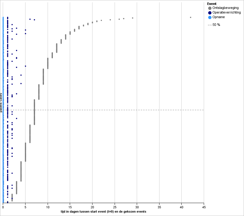
Some more screenshots of PROM visuals with the produced output you can find here : http://mijnpictures.blogspot.nl/2013/06/examples-prom-output-with-sql-produced.html
hope you enjoy this solution.
Daan Blinde
I'd like to share my solution for creating PM-logs in mxml format straight from SQL Server.
The trick is to use the FOR XML PATH statement.
Consider you have a table with the following fields :
1. Event_key (e.g. DBCs_Key)
2. EventName (e.g. Closing DBC)
3. DateTime event
3. Department
With the next SQL statement you can easily create the MXML output that is needed for PROM or other tools.
SELECT hdr.DBCs_Bkey as "@id"
,
(
SELECT
EventName as "WorkflowModelElement"
,'Start' as EventType
,DateTimeEvent as "Timestamp"
,Department as "Originator"
FROM [ASZ_DBC_ProcesStappen] as dtl
WHERE dtl.DBCs_Bkey =hdr.DBCs_Bkey
FOR XML PATH('AuditTrailEntry'),TYPE
)
FROM (SELECT DISTINCT dbcs_bkey FROM ASZ_DBC_ProcesStappen) as hdr
FOR XML PATH('ProcessInstance'),TYPE,ROOT('Process')
This would give you the xml output as shown in the below link.
The only thing you have to add is the header info and a footer (if you are interested i can provide one) .
If you put the sql statement in a view or stored procedure you can easily filter the log with just SQL statements !
Some more screenshots of PROM visuals with the produced output you can find here : http://mijnpictures.blogspot.nl/2013/06/examples-prom-output-with-sql-produced.html
hope you enjoy this solution.
Daan Blinde
https://www.linkedin.com/groups/How-generate-MXML-straight-from-1915049.S.253072885?type=member&gid=1915049&view=&item=253072885